For twelve days I put a phone on a tripod, pointed it at my own wrist, and counted frames. The number that came out the other end is 1.4 seconds — the gap between the fastest and the slowest Apple Watch face I tested, on the same wrist, over the same ordinary questions, with the same underlying data. The verdict, stated once and up front: complication density costs more time than it saves, and the face I'd hand to most people in the ecosystem is California with two complications, which landed within a fifth of a second of the plainest face on the system while still telling me something.
This is a magazine about caffeine and sleep, which is a strange place to run a stopwatch on watch faces until you notice how much of both lives on your wrist. A cutoff time. A wind-down reminder. A sleep score you look at before you've had water. The face is the interface to all of it, and the interface is design — not decoration, but the specific arrangement of numerals, contrast, and empty space that decides whether you get an answer or start a small research project at 7:40 in the morning.
What 1.4 seconds actually is
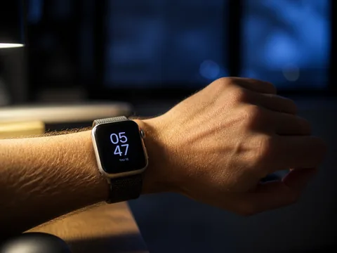
The rig was unglamorous. An iPhone on a tabletop tripod, shooting 240 frames per second at 1080p, aimed at the spot where my left wrist comes up when I'm sitting at my desk. A cheap desk lamp stayed in the same position all twelve days so the exposure wouldn't wander. One face per two-day block, six faces, order chosen by die roll so the first-day novelty effect didn't all land on one design.
A "glance" is defined narrowly here, because everything depends on the definition. It starts at the first frame where the display steps from its always-on dim state to full brightness, and it ends at the first frame where my wrist begins rotating away. At 240 fps each frame is 4.17 milliseconds, so the precision is far finer than the differences I'm reporting; I rounded everything to hundredths of a second and stopped pretending the third decimal meant anything.
I captured 312 raises and used 289. The 23 I threw out were raises where I then touched the screen — that's a task, not a glance, and tapping into an app tells you nothing about whether the face answered the question. I also cut anything during a workout, because the workout view takes over anyway. All six blocks ran on a 46 mm aluminum watch with the always-on display left on, wrist detection on, and the same accent color everywhere the face permitted one. Where two faces could carry the same complication, they carried it — the point was to compare arrangements, not to compare a face that shows the weather against a face that doesn't.
I report medians rather than means because the tail is long and stupid. One raise on Infograph clocked 6.2 seconds, but only because a text arrived mid-glance and I read it. A mean would let that one moment redraw the whole comparison.
The six faces, and the times
| Face | Complications | Median glance | Raises per day | Wrist-on-screen per day |
|---|---|---|---|---|
| Simple | 1 (date) | 0.62 s | 54 | 33 s |
| Solar Dial | 2 | 0.71 s | 57 | 40 s |
| California | 2 | 0.83 s | 58 | 48 s |
| Metropolitan | 4 | 0.94 s | 61 | 57 s |
| Activity Digital | 3 | 1.11 s | 63 | 70 s |
| Infograph | 8 | 2.04 s | 71 | 145 s |
The headline gap is Simple to Infograph: 0.62 to 2.04, a 1.4-second spread on the identical act of finding out what time it is. Multiply by the raise counts and the daily totals separate harder than the per-glance numbers suggest — 33 seconds of screen-looking a day versus 2 minutes 25. Over a year that's about eleven extra hours of looking at my own wrist, which sounds damning until you say it out loud and realize eleven hours a year is nothing. I'm not going to pretend I recovered a lost weekend. The interesting part isn't the total; it's that the dense face got raised more often, not less, which is the exact opposite of the promise it makes.
And the table has a row that breaks the story. Activity Digital carries three complications and lost to Metropolitan's four. Complication count is a bad predictor on its own. What actually happened is that Activity Digital stacks the three rings in the same visual center as the time, at roughly the same weight, so my eye had to decide what it was looking at before it could read anything. Metropolitan's numerals are enormous and unambiguous; the four corner slots sit far enough out that they don't compete for the middle. Weight and position beat count.
Where the time actually went

Watching 289 raises back at quarter speed is a tedious way to spend an evening and the single most useful thing I did. You can see the eye movement in the wrist — there's a small stabilizing pause when you've found what you wanted, and a tiny second correction when you haven't.
Infograph's problem is that its four corner complications sit on an arc, and an arc has no reading order. On a grid layout your eye learns "top-left, then down." On a curve, there's no first item, so every glance starts with an unconscious decision about where to start. In the footage this shows up as a genuine hunt: the wrist holds, drifts a few degrees, holds again. It's not that eight data points take eight times as long to read. It's that I was never reading eight. I was reading one, and paying a search cost to find it.
California is the surprise of the test and the reason it wins my recommendation. It mixes Roman and Arabic numerals around the dial, which reads as a charming period affectation and is functionally a legibility trick: every hour position has a distinct silhouette. XII, 1, II, 3 — you don't parse the character, you recognize the shape. That's why a face with two complications came within 0.21 seconds of a face with one.
Solar Dial is the one I wanted to win and didn't, quite. It's the most beautiful thing on the system and it was fast — 0.71 s — right up until dusk, when the gradient sky slides underneath the numerals and the contrast ratio goes with it. Indoors it never mattered. Outdoors at 8 p.m. in August I had two raises over 1.5 seconds, both of them me tilting my wrist to kill a reflection. A face whose contrast is a function of the time of day is a face that's fast for most of the day.
The finding I trust least and find most interesting: the faces that cost the most time were the ones whose always-on rendering differs most from their awake rendering. Metropolitan changes its numeral treatment when you lower your wrist — genuinely lovely, and it means the composition your eye recalibrates from isn't the composition it lands on. Infograph dims its complications to the point where the corner icons lose their color coding entirely. Simple looks essentially the same asleep and awake, and Simple won. With six faces I can't call that a predictor; it's a hypothesis, and it's tangled up with density, since the busiest faces also have the most to dim. But it's the pattern I'd test next.
What 1.4 seconds does not measure
Here's where I have to argue against my own number, because a stopwatch is a stupid instrument pointed at a smart question.
It doesn't measure whether I got the right answer
Halfway through I added a crude accuracy check: at randomly timed moments I'd raise my wrist, say out loud what I'd just read, and check it against the actual value. Twenty prompts per face, which is a small enough sample that I'd argue with anyone who called it a result. On the four sparse faces I was right every time, mostly because there was nothing to be wrong about. On Infograph I was wrong twice — both times I read the noise-level complication as a battery percentage, because at a dim glance a two-digit number in a circular gauge is a two-digit number in a circular gauge. Speed and accuracy didn't trade off against each other here. The dense face was slower and wronger, which is the least flattering combination available.
It doesn't measure how often I looked
The raises-per-day column is the number I keep thinking about. Seventy-one raises on Infograph days against fifty-four on Simple days is a 31% difference in how often I bothered my own wrist, and I can't cleanly explain it. Novelty is a real confound — an interesting face invites checking. But part of it, I think, is that a face which almost answers your question generates a second glance. You look, you get the time and a partial read on something else, and forty seconds later you look again to finish the thought. Sparse faces don't start thoughts they can't finish.
It doesn't measure anything after dark
I have to be straight about this: the rig only ran at my desk, in daylight, indoors. It captured none of the glances that matter most to a magazine about sleep. I didn't film the 3 a.m. raise. I noticed it — with the always-on display and Sleep Focus both active, rolling over and lifting my arm lights the screen enough to matter in a dark room, and on the dense faces there's simply more lit surface area doing it. That's an observation, not a measurement. I also have twelve nights of sleep data from the watch itself, and it's far too noisy to attribute anything to a change in watch face. I'm not going to draw a line from typography to sleep onset. Nobody should.
It doesn't measure whether I liked it

The fastest face in the test is the one I'd least like to wear for a year. Simple is fast because it's inert. This piece is nominally about design, and the whole premise of a stopwatch is that time-to-answer is the thing worth optimizing, which is false in the way that all single-metric premises are false. You wear this object. It's visible on your body more than any other piece of technology you own. A fifth of a second is a rounding error; wearing something you find ugly for eleven waking hours a day is not.
The caffeine-cutoff test
The measurement I'd defend hardest isn't in the table.
I keep a complication that counts down to 2 p.m., which is my caffeine cutoff and has been for about two years. It's a Shortcuts-driven timer, nothing exotic — a number that gets smaller. On the sparse faces it was one of two things on the dial. On Infograph it was one of eight.
On California days I noticed it at around 1:40 p.m. on three of the four afternoons and didn't make the second coffee. On Infograph days I noticed it once. It was rendering the whole time. It was legible the whole time. I had simply stopped seeing it, in the way you stop seeing a poster you walk past every morning — a corner complication on a busy face becomes furniture within about a day and a half.
Eight afternoons is not a study and I'd laugh at anyone who published it as one. But it reframes the entire experiment for me. A complication's value isn't the information it displays; it's whether the information changes what you do. By that measure, adding a ninth thing to a face doesn't just cost you 1.4 seconds. It quietly demotes the one thing that was working.
The winner, stated plainly
California with exactly two complications is the best face on watchOS for most people: it costs you two-tenths of a second against the plainest face on the system, and it's the only design in my test where the thing I needed to see was still working after a week.
Second place is Solar Dial, with an asterisk about outdoor evening contrast. Simple wins on the stopwatch and I don't recommend it to anyone who isn't running an experiment. Infograph is a genuinely good design being asked to do a job it can't do — as a hub you tap into, it's excellent; as a thing you glance at, it's the slowest option here by a wide margin.
Who this is for, and who it isn't
This is for you if you check your wrist a lot, mostly for one or two recurring things, and you've been slowly adding complications for months because each individual addition seemed free. It isn't free. Try dropping to two for a week and see whether you actually miss the other six, or whether you just miss the feeling of having them.
It's also for you if you bought an Apple Watch primarily to reduce phone pickups. That goal is better served by a face that answers fast and sends you to the phone for everything else than by a face that half-answers eight questions.
It isn't for you if your watch is primarily a training computer. During workouts none of this applies — the workout view is the interface, and mid-run legibility is a different problem with different answers. It also isn't for you if you're a genuine dashboard person: some people really do check six live values, and if you're one of them, the search cost is amortized across six real reads instead of one. And it isn't for anyone hoping this is a sleep intervention. It isn't. It's a design test with a sleep-adjacent complication attached.
Running it on your own wrist
You need a weekend, not twelve days, and a phone that shoots slow motion. Set the phone where your wrist naturally comes up. Pick two faces — your current one and a deliberately sparser alternative. Film a single sitting day for each, scrub the footage at quarter speed, and count from screen-wake to wrist-drop on twenty raises apiece. Twenty is enough to see a difference of half a second; it is nowhere near enough to see a difference of a tenth.
Two things I'd do differently. First, keep the complication data identical between the faces you're comparing, or you're testing content, not design. Second, run at least one block outdoors in the evening — that's where Solar Dial lost time and where I'd never have seen the problem indoors.
And film the accuracy check, not just the speed one. Time-to-answer is easy to measure and only half the question. The raises where I confidently read the wrong number never showed up as slow ones. The myth is that a good watch face is a dashboard, and the more it shows you, the less you'll have to reach for your phone.
The more accurate version is that a good watch face is one answer rendered large, and everything else on the dial is a tax you pay sixty times a day for information you'd already stopped seeing.